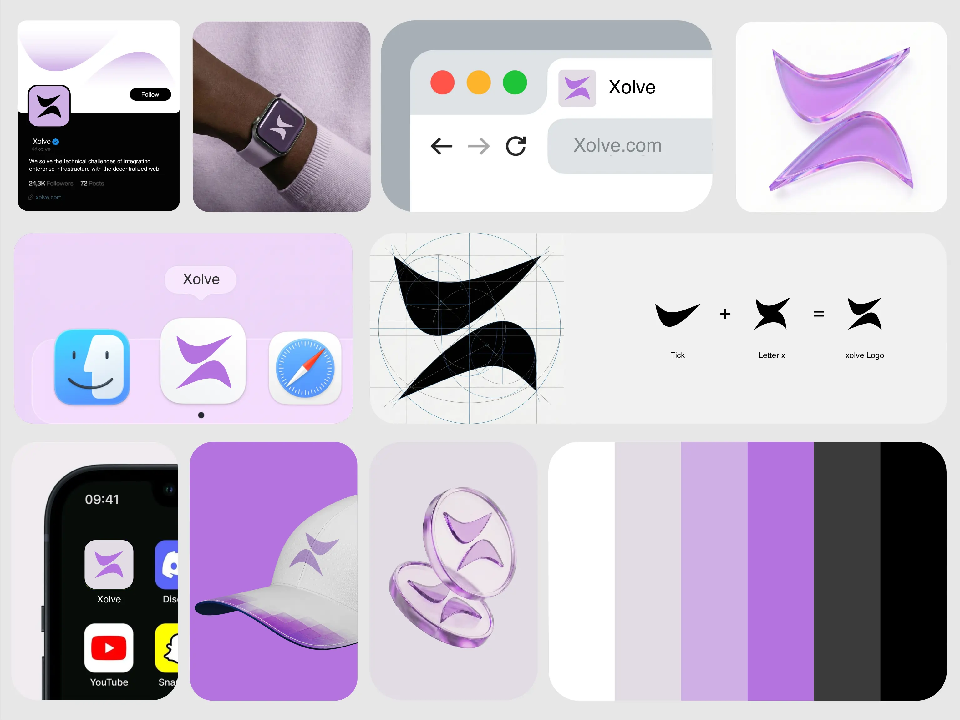
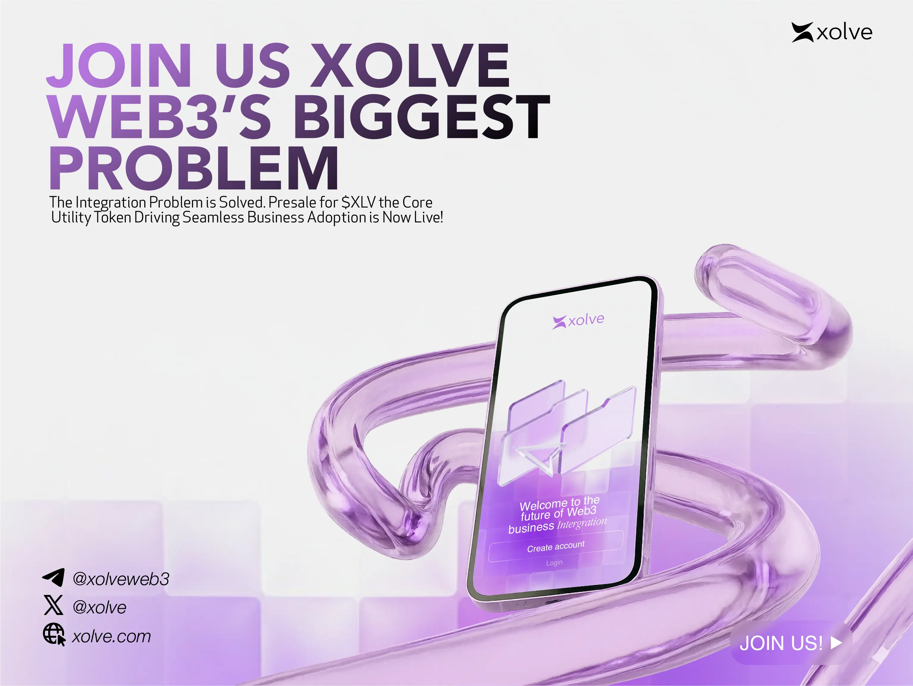
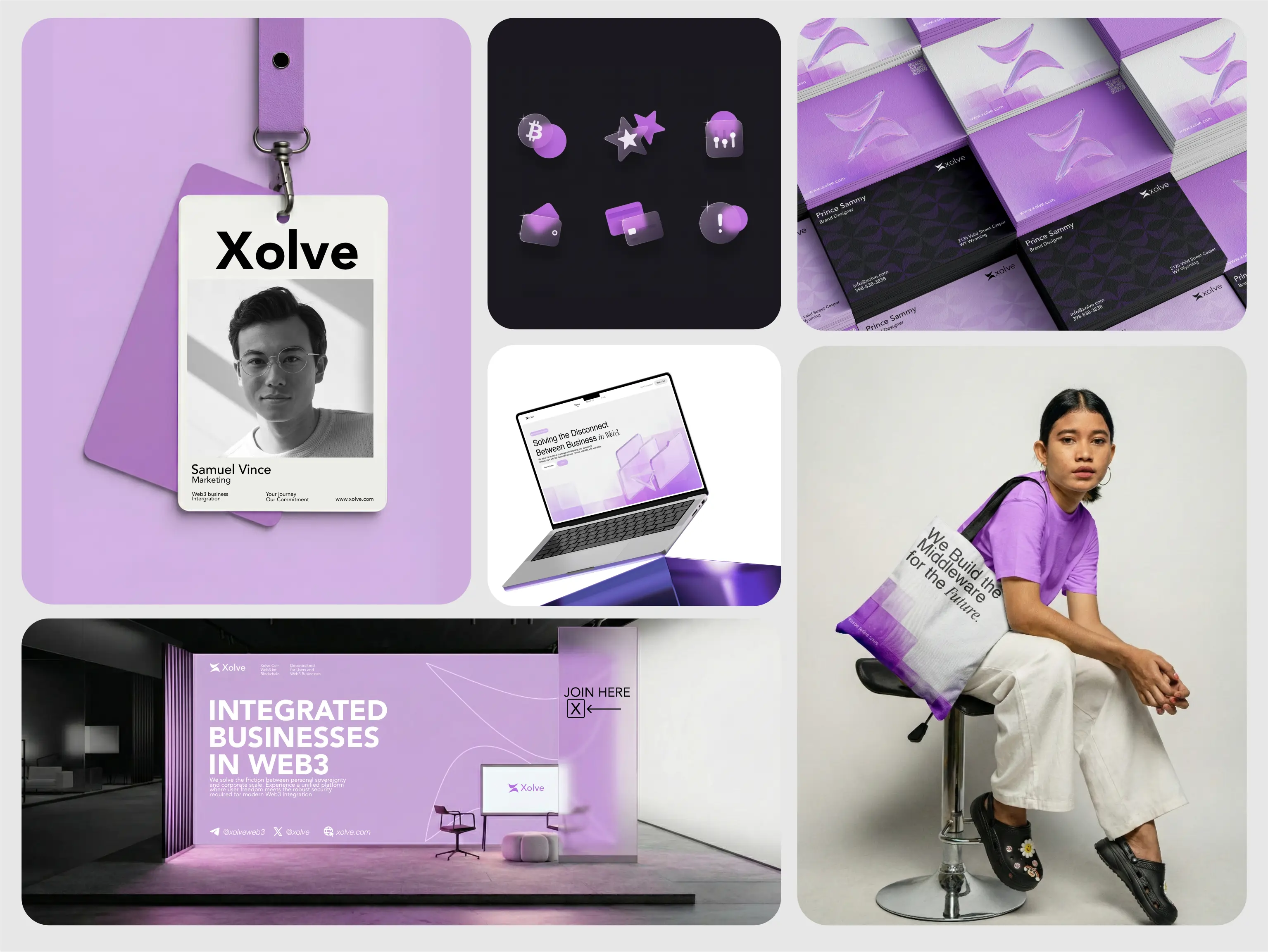
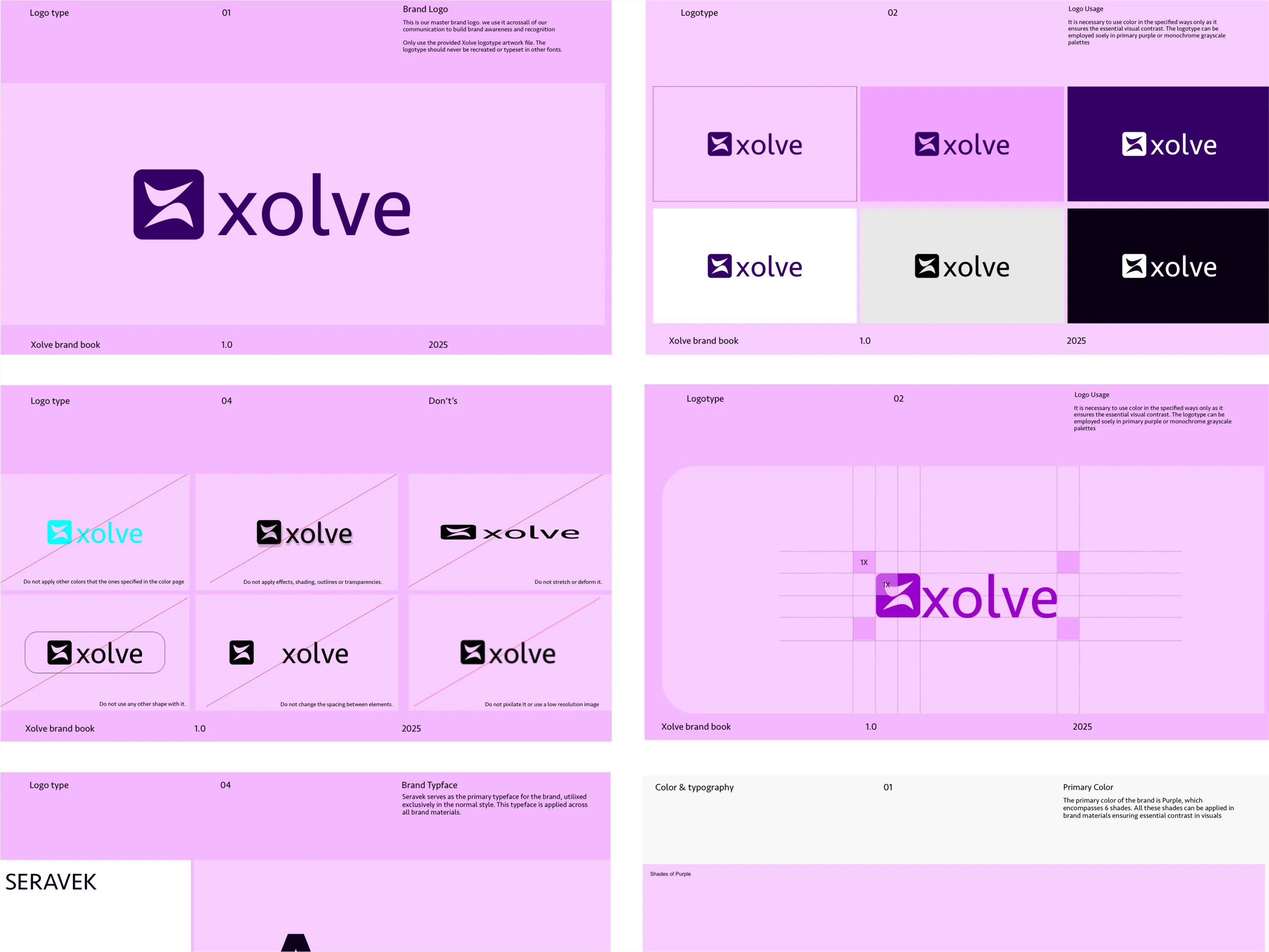
Xolve is a Web3 infrastructure company helping businesses adopt blockchain in practical ways. From the start, they wanted an identity that feels serious and product focused, not like another short term crypto project. I began with the logo mark, designing a clean arc that represents movement from problem to solution. It is simple, controlled, and built to work seamlessly as an icon, motion element, and core brand symbol. The wordmark is sharp and modern for strong screen visibility, supported by a high contrast palette of Deep Void and Electric Violet. The full system extends across the landing page, presale campaigns, social content, and merchandise, creating a clear and scalable identity built for long term growth. The result? A Web3 brand that looks like it’s here to build something real, not disappear after the presale. :)
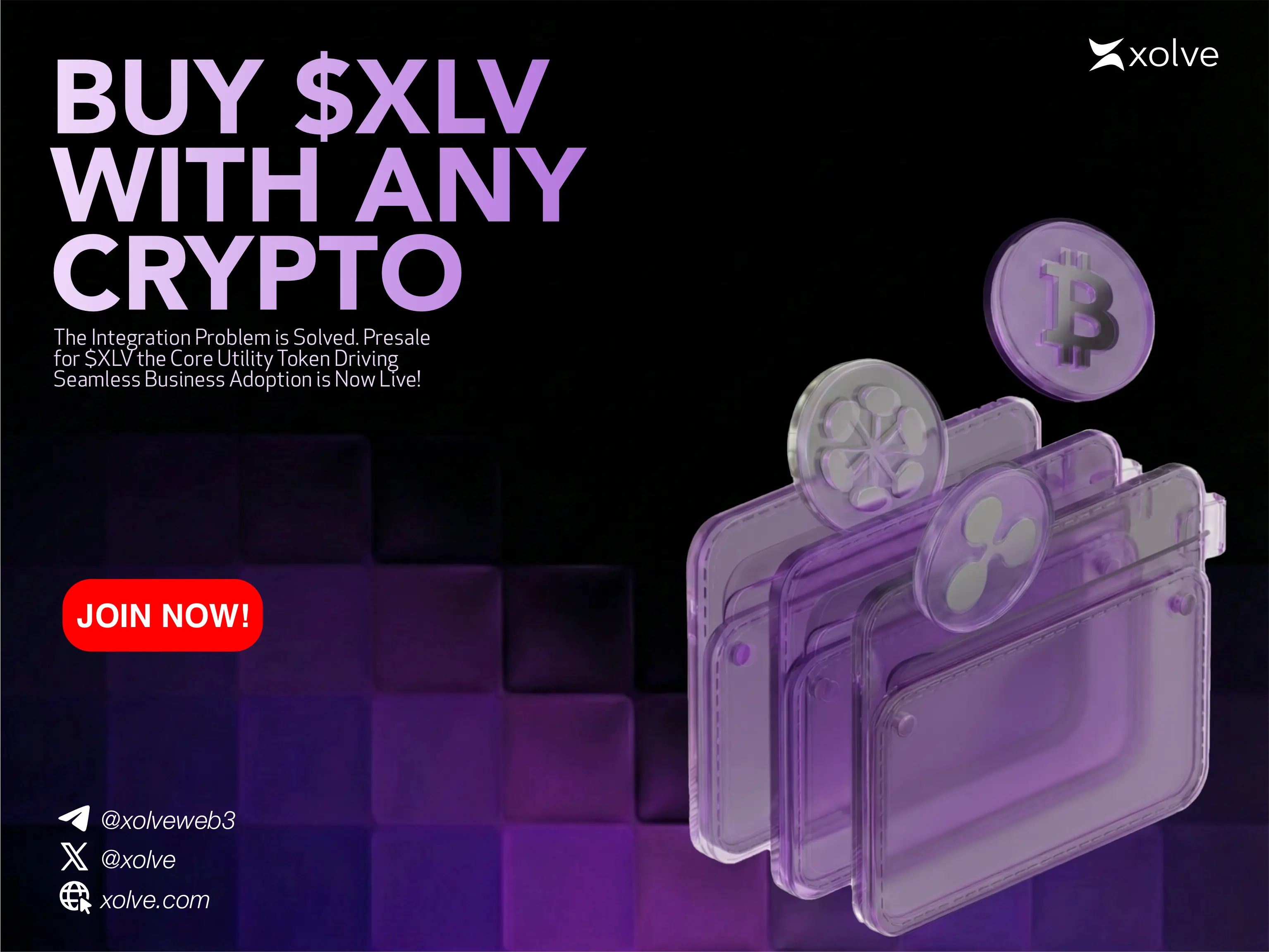
70% of Web3 projects fail within the first two months because people don’t trust them. Xolve had to be different.